

Blind and low-vision
Semantic structure, useful alternatives, strong contrast, and thoughtful focus user flows.
OPEN TO RELOCATION · B2B RETAIL SOFTWARE
UX/UI designer with 7+ years in technical account management for commercial retail property software. I bring system thinking, client empathy, and problem-solving. I developed my skills in enterprise technology and now apply them to designing intuitive, accessible experiences for property management companies.
savannah.givan1@gmail.com 513-407-2779
MY WORK
About Me
At Yardi Systems I helped retail clients navigate complex property management software, develop and troubleshoot workflows, understand system releases, and keep business-critical work moving for clients that align with their business goals.
Working directly with users taught me to listen for the problem behind a request, identify recurring friction, explain technical ideas clearly, balance user needs with business constraints and keep the client happy. I moved into UX/UI design because I want to apply those lessons before avoidable problems reach the people using a product.
I now combine that enterprise perspective with UX research, interaction design, prototyping, and usability testing to create experiences that are useful, understandable, simple and inclusive.
Accessibility advocacy
Semantic structure, useful alternatives, strong contrast, and thoughtful focus user flows.
Captions, transcripts, visual cues, and messaging that never relies on sound alone.
Predictable patterns, reduced motion, clear language, and manageable cognitive load.
Readable type, clear hierarchy, generous spacing, and content that is easy to scan.
Keyboard access, generous targets, and support for assistive and adaptive input.
Every platform should consider cultural norms and race in its design so that imagery, language, and interactions feel respectful and relevant to the diverse people who use it.
DESIGN THINKING
EXPERIENCE
TECHNICAL ACCOUNT MANAGER · YARDI SYSTEMS INC.
Retail clients faced platform-adoption challenges, inefficient workflows, changes introduced by system updates, and recurring points of confusion in business-critical software.
I worked between end users, client stakeholders, support teams, and development teams. I investigated cases, identified patterns in client feedback, translated technical concepts for non-technical users, and advocated for user needs during escalations.
I learned to look beyond the immediate support request and ask what in the workflow, language, or system behavior created the problem. That approach helped me turn customer frustration into clear, actionable context for the teams responsible for the product.
Recurring client cases, direct conversations, training sessions, implementation work, and system release feedback gave me a close view of user behavior and adoption barriers over time.
My work improved user understanding, workflow processes, and customer satisfaction while supporting long-term client relationships. It also gave me a practical foundation in usability analysis, stakeholder and cross-functional team communication and product thinking.
This experience is why I moved toward UX/UI design. I want to help prevent usability problems during the design process, not only help users recover from them after launch.
01 / PROJECT
UX RESEARCH AND DESIGN · TEAM PROJECT
Nyland’s website had scattered information, inconsistent navigation, broken links, low contrast, and unclear paths to housing details. People struggled to understand cohousing and complete key tasks.
Our team combined heuristic evaluation, surveys, task analysis, usability testing, journey mapping, sketching, and prototyping. I created five personas from survey findings to keep different goals, frustrations, ages, and levels of technical comfort visible in our decisions. I also presented the project with another team member to Nyland's stakeholders
We simplified the top-level navigation, centralized housing and community information, strengthened visual hierarchy and contrast, and made actions such as joining a waitlist or contacting Nyland more explicit.
Research with 20 participants showed repeated difficulty understanding cohousing, locating availability and pricing, and navigating the existing site. Those patterns guided our recommendations rather than visual preference alone.
The final prototype clarified housing search, community information, and involvement steps. The project was selected for presentation to Nyland’s board members and IT department based on the strength of the research and recommendations.
Watching people struggle with information tied to a major life decision reinforced that clear navigation, accessibility, and careful communication are essential to trust, not just designing.
02 / PROJECT
UX/UI DESIGN · FIGMA
Three venues needed to move from in-person ticket sales to one digital experience without making event discovery, purchasing, or venue identification feel complicated on a small screen.
I designed the end-to-end flows for account creation, sign-in, event browsing, filtering, checkout, and retrieving barcode tickets. I reviewed and documented stakeholder requirements and common mobile ticketing patterns before mapping the experience.
I used filters instead of relying on search, removed the shopping-cart step to shorten checkout, added persistent navigation for events and accounts, and prioritized venue labels and event imagery for faster scanning.
The requirements made two moments especially important: comparing events across three locations and retrieving a ticket quickly at the venue. I used those moments to prioritize information and remove avoidable steps.
The prototype supports event filtering by venue, genre, location, and date; a simplified purchase flow; email verification; and direct access to virtual barcode tickets from an account.
This project helped my thinking beyond individual screens toward a complete journey. In a future iteration, I would test ticket transfer, saved payments, and more accessibility improvements with users.
03 / PROJECT
UX RESEARCH · SELF-DRIVEN WORKPLACE SYSTEM EVALUATION
A new internal system needed to be evaluated around the tasks employees would need to complete, with enough structure to reveal friction and capture useful feedback.
I created the usability testing documentation and centered my evaluations on task completion, efficiency, observations and user feedback rather than feature review alone.
I framed the study around realistic tasks so observations could show where the workflow supported employees and where instructions, labels, or steps might create uncertainty.
The test plan paired task-based observation with user feedback to capture both what participants did and how they understood the experience.
The completed study created a structured way to evaluate the internal system and communicate usability findings. Specific workplace details remain confidential. I was able to provide my perspective as an employee who used the product myself and had the opportunity to help the health administration make the platform much easier for their staff.
The exercise strengthened my ability to turn broad feedback from scratch into focused usability questions while respecting the context and privacy of an internal product.
04 / PROJECT
VISUAL DESIGN · INDIVIDUAL PROJECT
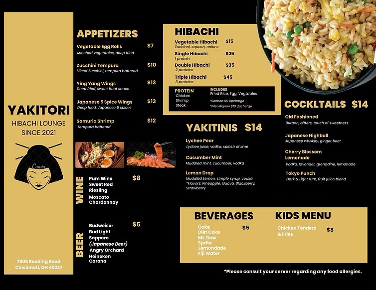
The original menu needed a clearer visual structure so diners could distinguish sections, understand relationships between items, and scan choices more efficiently.
I reviewed the original organization, redesigned the menu, and documented the reasoning behind each revision in a supporting design memo.
I used proximity to group related content, alignment to create predictable reading paths, contrast to clarify priority, and repetition to make sections feel consistent.
Comparing the original and revised layouts made it possible to evaluate how each design principle changed the hierarchy and scan path.
The revised menu presents categories and choices in a more organized visual system while preserving the restaurant’s core information.
This project reinforced that visual polish should serve comprehension. Even small choices in spacing, alignment, and emphasis can lower the effort required to find information.